About The Project
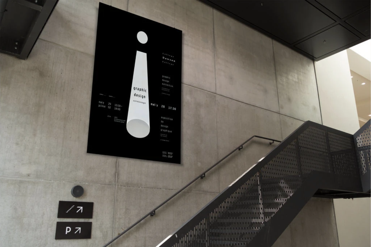
Each student was tasked with the concept and creation of their year's Vernissage Poster. This design would represent and define the concept for combined vernissage of that year's graduating students.
This poster was top two in the faculty vote.
The Exploration
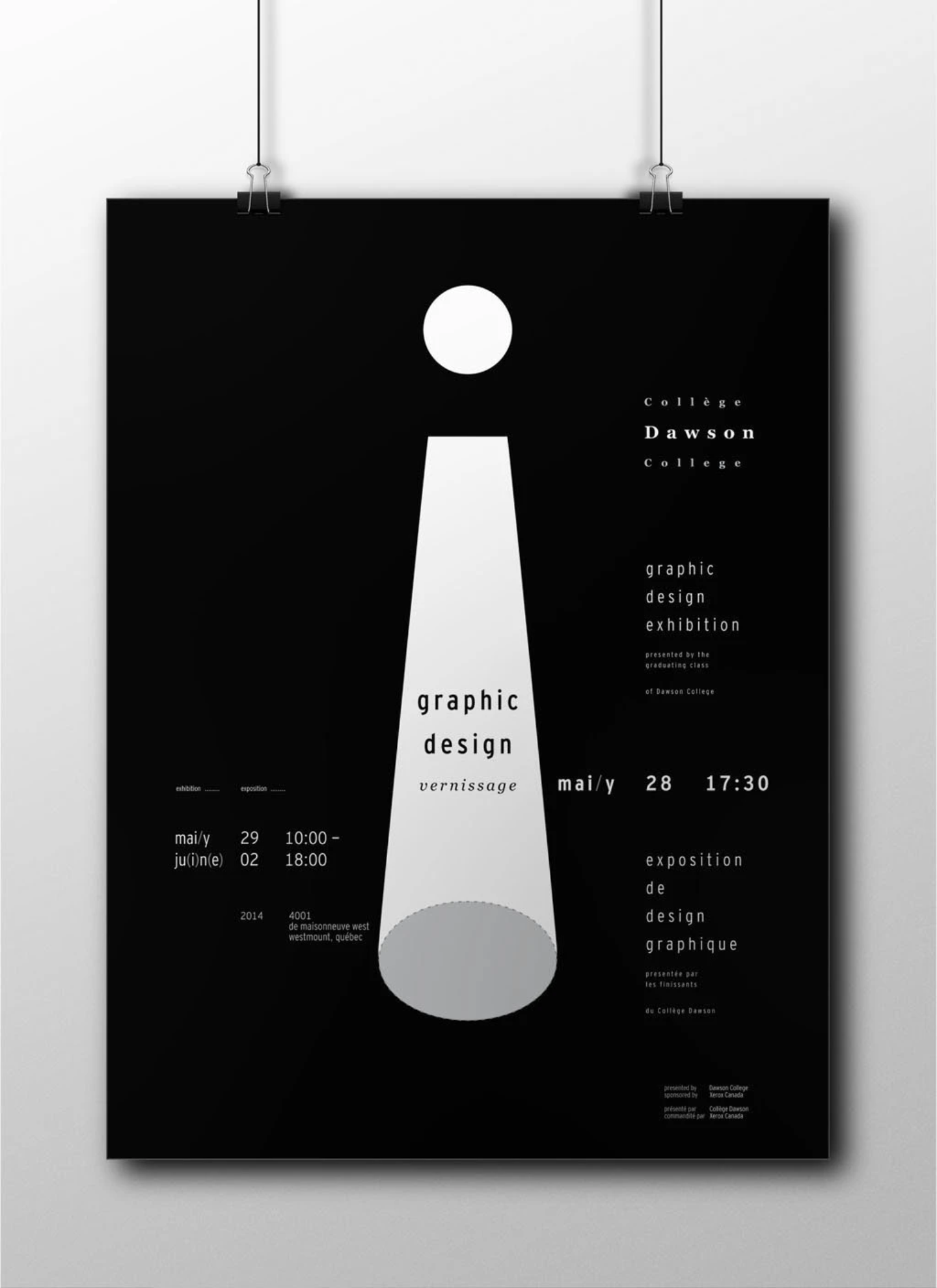
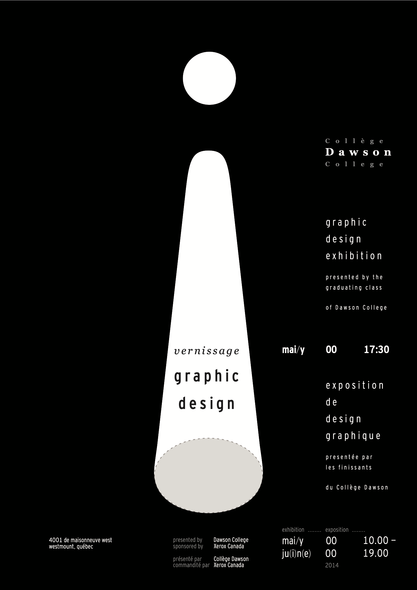
My concept began with an exclamation mark, as I tied the element of typography with the idea of the Vernissage as an exclamation point for the projects to receive their notice.
Then, of course, ensued an exploration of exclamation points..

An exercise in subtlty, this central glyph would represent a spotlight as much as a glyph to convey a sense of notice; turned on its head, the works would speak for themselves, reversing the role of the simple glyph. As this mark would take on a spacial quality, the mark would also need to a spacial element, requiring something that conveys the conceptual sense while being structurally useful in structuring the containment of the poster's content.
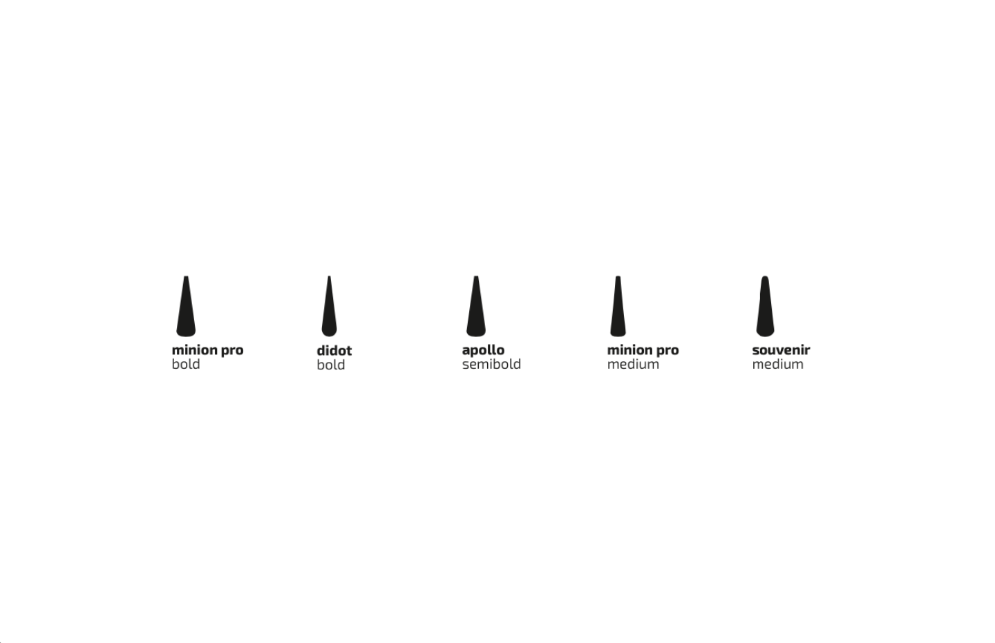
As though the finalists filed onto a stage, the final candidates were decided as the poster's central element.